Brand Identity
THE CLIENT:
Families First
MY ROLE:
Lead Graphic Designer in collaboration with design team at Artists For Humanity
THE CHALLENGE:
The task at hand was to redesign the outdated visual identity for Families First an organization who brings parents of young children together in their communities to strengthen their parenting knowledge, skills, and support systems. The goal was to design a visual that supports their organizational vision: Every parent is strong and supported; Every child is thriving and resilient; and, every community benefits from the power of parents.

THE SOLUTION:
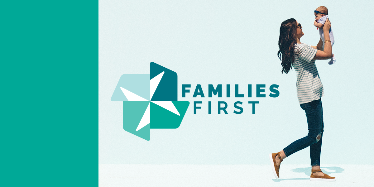
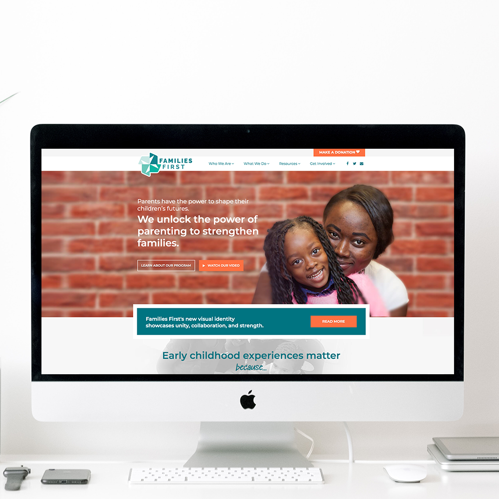
Our mission behind the visual representation of the Families First brand is to conveys power, strength, community, and progress. The icon derived from an exploration of various ways to abstractly represent a weaving of shapes. It evolved into the idea that various pieces woven together will produce one stronger unified object. This particular design evokes the imagery of a pinwheel, in which intentionally placed shapes generate motion and forward progress. Like the parents in their programs, each piece of the pinwheel moves the next piece forward, until they are all moving forward together. The colors, a gradient of blue-green shades, represent the diversity of their population and community. The joining of these shapes also symbolizes the many voices that contribute to Families First’s impact—their staff, board, volunteers, parent participants and their families, program partners, and funding partners. As these collaborators come together to invest in the power of parents during the important early childhood years, we are building a strong foundation on which the next generation can thrive.
THE PROCESS:
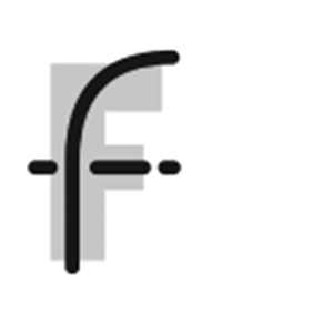
Our concepts derived from an exploration of shapes that symbolize working together and growth. We also explored using the double "F" in Families First.


