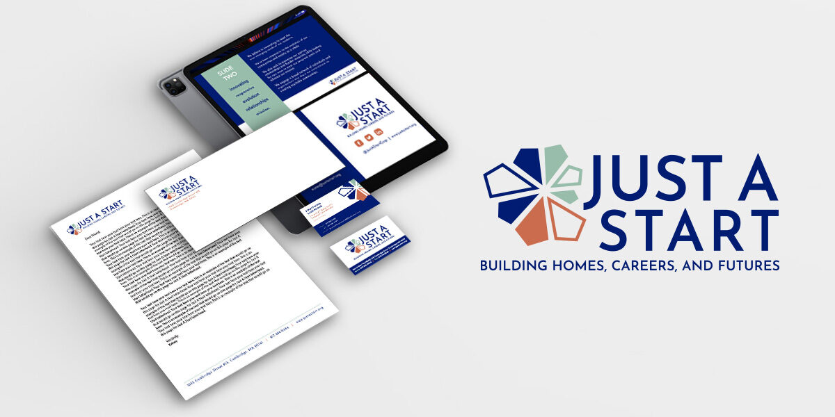
Just A Start Rebrand and Visual Identity
THE CLIENT:
Just A Start
MY ROLE:
Design Director
THE CHALLENGE:
Collaborate with Flowetik to rebrand and redesign the visual identity for Just A Start as well as produce additional collateral materials in line with the redesign.

THE SOLUTION:
The Just A Start logo is a visual representation of their core values, meant to express a recognizable identity so their community can consistently remember them. The geometric shapes of various lengths, sizes, and styles express the wide variety of programs and services we offer to our diverse community. When partnered together, each individual shape acts as its own meaningful resource, ultimately becoming one larger, stronger, circular, cohesive network. Each part contributes to the whole, conveying a welcoming sense of belonging. The points on each end feel directional, symbolizing our ambitious goals and the unique paths that Just A Start strives to help their participants pave.