Brand Identity
THE CLIENT:
The Guild For Human Services
MY ROLE:
Lead Graphic Designer at Artists For Humanity / In collaboration with Jonathan Tejeda and Jordan Nelson
THE CHALLENGE:
Create visual identity for The Guild For Human Services, a place of lifelong learning and community for people with complex special needs. The Guild uses collaborative, cross-discipline teams built around each individual. From school age-children to adulthood, they use collaborative, multi-faceted teams built around individuals, to help them live their best possible lives.
THE SOLUTION:
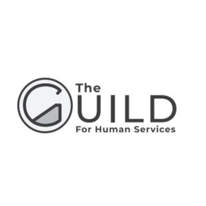
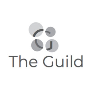
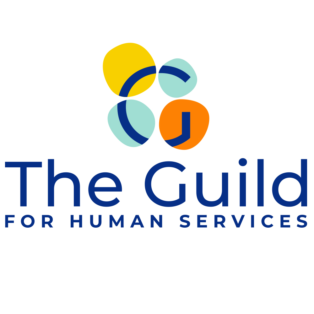
The visual representation of The Guild for Human Services brand conveys community, unity, diversity and respect. The icon derived from an exploration of various ways to abstractly represent the many individuals working together to achieve community and independence for each member. An homage to The Guild’s founding as The Protestant Guild for The Blind, the icon is grounded in a representation of four circles that symbolize the letter ‘G’ in braille. The contemporary depiction of this concept evolved – aligning with the values and goals of The Guild – into the use of four organic circles of varying sizes, each ever so slightly different from the next, to produce one stronger unified ‘G’ when juxtaposed together. The various colors represent the diversity of our community while respecting accessibility. The joining of these shapes by the letter G also symbolizes the many people making an impact at The Guild – our individuals, their families, staff, teachers, board, volunteers, donors and partners. These collaborators come together every day to invest in supporting the independence of each individual, creating a community that can be counted on to help each individual thrive.
THE PROCESS:
Our concepts derived from an exploration of what the history of a guild is and how this organization utilizes and respects the collaboration of many people to arrive at a sense of growth, respect, independence and belonging for each community member.
